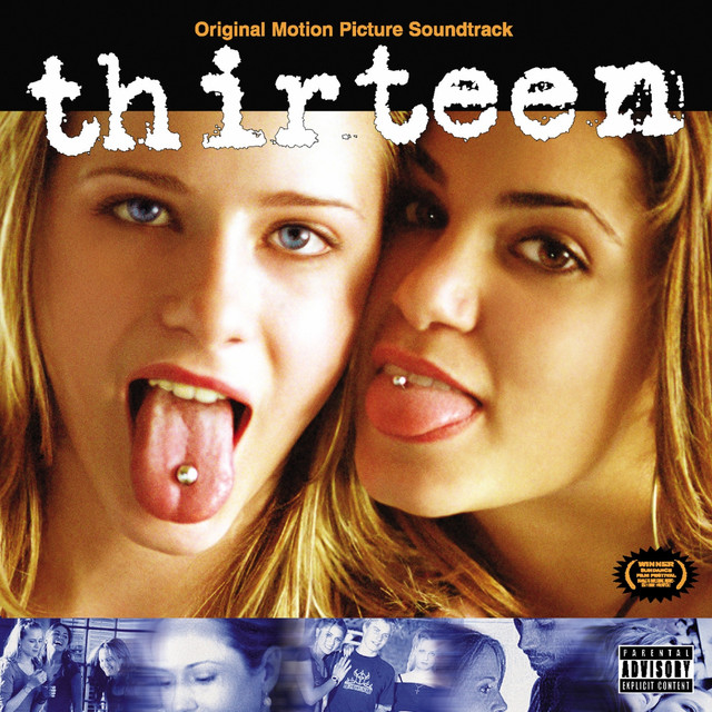
What if six days of teenage trauma could become one of the most brutally honest films ever made? The movie “Thirteen” (2003), directed by Catherine Hardwicke, is more than just a surprising story about a middle school girl falling into peer pressure. It’s loosely based on the real-life experiences of Nikki Reed (most known for her role as Rosalie in the Twilight series), who not only co-wrote Thirteen but also played Evie Zamora, the popular and manipulative best friend. Reed has said in interviews that she wrote the script in only six days, drawing inspiration from her own teenage struggles with growing up too fast, experimenting with risky behavior, and dealing with family issues. Knowing this, the movie resonates more deeply. It’s not just a cautionary tale, but a skit of reality. Part of what makes it so effective is the way the story is told through color. At first glance, it might just look like an indie film about teens experimenting with drugs, sex, and rebellion. Still, when you watch the movie closely, the color choices in each scene reveal what Tracy (the main protagonist) is feeling and how her world shifted in only four months. From washed-out blues to nauseating greens, the color palette mirrors her emotional journey as she transitions from innocence to chaos.
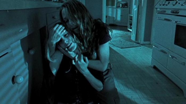
At the start of the movie, the colors are muted and washed out. Tracy’s home and school life seem plain, almost gray, showing how she feels invisible and overlooked. This mirrors Reed’s own feelings of being restless and disconnected from everyone as a teen. The dullness in these early scenes sets the stage for why Tracy is drawn to Evie’s world, which appears brighter and more exciting. One of the strongest colors in the movie is blue, which often appears in Tracy’s home. Whenever she and her mom argue, the screen takes on a bluish tint. For example, when they fight in the kitchen about Tracy’s behavior, everything looks very pale and distant. The blue makes everything feel heavy and uncomfortable. Blue becomes the color of sadness and disconnection, showing how broken their relationship is slowly becoming.
On the opposite side of the spectrum, red appears when Tracy is reckless. The clearest example is the scene in which she self-harms after having a flashback of her mom’s (Mel) boyfriend (Brady) overdosing. The blood is bright and shocking, almost the only vivid red in the film. It symbolizes both her inner pain and the dangerous choices she’s making. Red doesn’t just mean passion here; it represents anger, destruction, and the dangers of living too fast. The film also uses warm oranges and yellows in scenes where Tracy is out of control. At the parties with Evie, everything looks oversaturated. The colors almost blur into each other, making the scene feel overwhelming. This effect matches Tracy’s experience; she’s caught in an environment that feels exciting at first, but also overstimulating and chaotic. Evie’s influence is often connected to hot pink, especially in clothes and makeup. In the shopping scenes, when Tracy and Evie try on lip gloss and act “grown up”, pink takes over. At first, it feels fun and playful, like a symbol of girlhood. But as the story progresses, the pink starts to feel more artificial, almost like a mask hiding the darker reality of their behavior. What started as glamour ends up looking fake, revealing the emptiness and shallowness of their version of “fun”.
 Black and shadows also play a significant role in symbolizing scenery and the loss of innocence. Whenever Tracy and Evie sneak around, stealing or hanging out with older kids, the scenes are darker. The shadows don’t just make it look sketchy; they give a sense of danger, hinting at how deep Tracy is slipping into a life that she isn’t ready for. Towards the end of the film, the colors drain into pale whites and neutrals. When Tracy collapses on the ground in the final scene, screaming in exhaustion, the lighting is washed out. The color looks and feels almost lifeless, which matches how she feels inside. After all the highs and chaos, the world feels blank, as if she’s been completely emptied. Finally, there’s a green that appears in three distinct ways. Early in the film, the natural green of the park represents Tracy’s innocence when she’s still with her childhood friends. Later at school, muted greens appear in the background when she watches Evie with envy, showing Tracy’s jealousy of her popularity. And in Evie’s bedroom, the lighting sometimes has a sickly green tint, making the air feel toxic and nauseating. In this way, green transforms from a natural and safe entity to something poisonous. Just like Tracy’s transformation.
By the end of Thirteen, it’s clear that the movie isn’t just telling Tracy’s story through dialogue and action. The color choices are almost like another character, silently shaping the mood and meaning of every scene. Blue reflects her sadness, red shows her recklessness, orange and pink show the chaos or trying to grow up too fast, and green highlights the shift from innocence to toxicity. All together, the palette shows her crash from light to dark, from innocence to pain. Hardwicke doesn’t just need to spell out Tracy’s emotions in words; the colors do it for her.